Hey! Thanks for taking the time to check out my work. I specialize in user experience and branding design.
Hey! Thanks for taking the time to check out my work. I specialize in user experience and branding design.
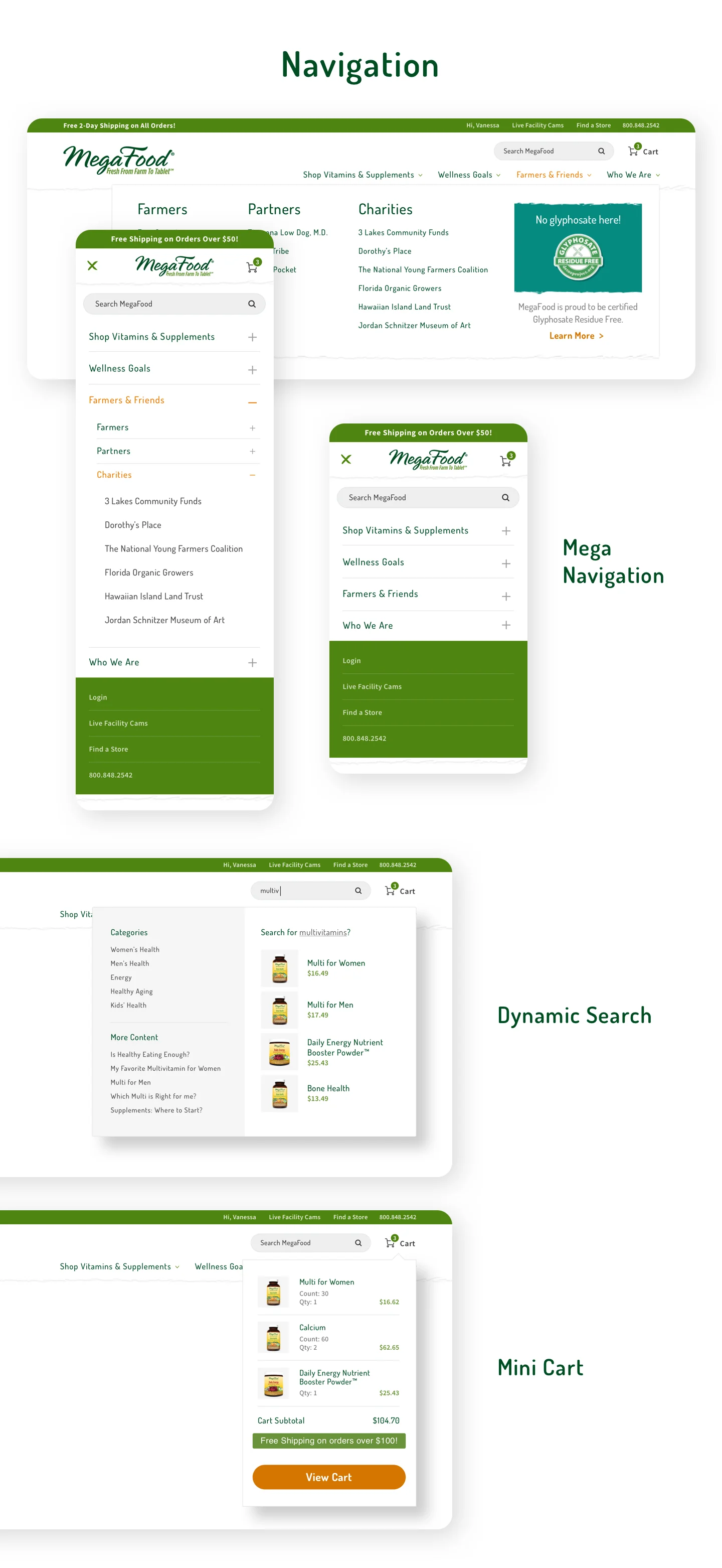
MegaFood wanted to take their existing web site and add in the capability for their customers to purchase product right from their web site. Many of the pages had to be re-designed with e-commerce best practices in mind.
Sporting life needed a completely new e-commerce website design and strategy that could scale with them and the market demands over time.
The goal with Bauer Hockey was to brighten up the website from their past dark look and feel. I wanted to make the website clean, minimal, and highlight products for the most shopable experience possible.
I also wanted all the modules to be relatively easy for the clients to update without worrying to much about photography and text overlays.
The customer experience had to be just as good on mobile as it is on desktop. So, this web-site was designed mobile-first which allowed all modules to scale.
Zone Diet came to us wanting a fresh new look. The brand hadn’t been updated in years and an aggressive new strategy demanded the design be updated to attract a younger, newer audience.
Vibram needed an event page for a series of bus tours traveling the United States promoting the sole technology. Customers could come to this splash page to get tour location and details.
YSL came to us wanting a fresh new homepage. They also wanted the homepage to be highly personal.
I made the navigation as simple as possible to encourage browsing searching, and discovering new products. I also highlighted the account login and info area at the top right hand corner of the navigation. Having the customers name right there establishes the personal feel right away.
Further down, each product selection and language choice is based on the customers past shopping experiences, browsing patterns and past orders. Inserting the customers name into headlines and copy also makes the website highly personal.
Pak 2000 came to us needing a complete web site over-haul. They wanted a site that was very modern, clean, minimal and easy to navigate.
One of the things we did for them was update their blue color to a more vibrant color. This allowed us to really push the limits on the site regarding the color palette.
I gave them a site that has large blocks of colors and images so navigation is clear. One of the things I enjoyed the most was thinking though and designing how the search functionality would work.
Farmhouse and Cottage is a boutique company that offers a wide variety of new and custom built furnishing solutions. They wanted a web site design that clearly showcased the many furnishing styles they offer their customers.
Color was important to them. I was able to come up with a robust but cohesive color palette that would bring cohesions and visual interest to the site.
Typography was another big concern of theirs. They wanted something clean and modern but still has that classic feel. I paired up a san serif and serif font to accomplish this goal.
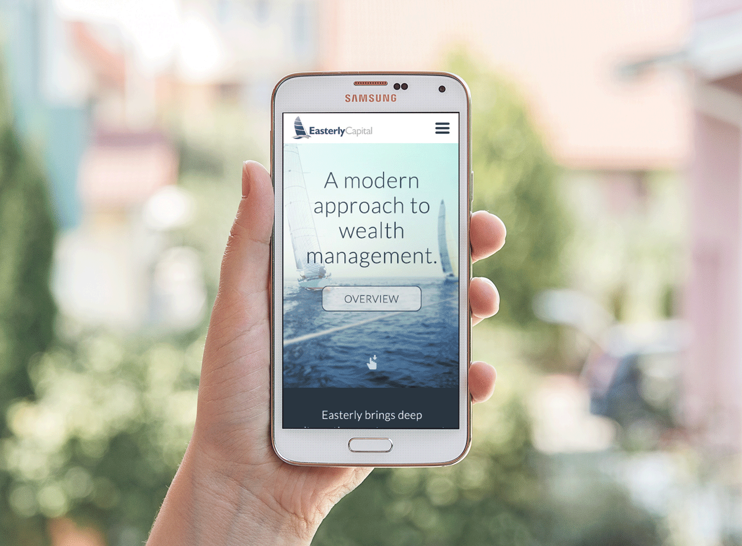
Easterly Capital wanted a modern website that utilized floods of color. I introduced the yellow color for all the call to actions.
The hero banner was really fun to design. I experimented with throwing out the typical separation between the navigation and hero banner. In the final version, we put a lopped video of sailboats out on the water in the hero banner.
A collection of various logos I've done for various clients and projects.
Yaganes is a seafood distributer located in Chile, South America. They wanted a logo that touched on the rich fishing heritage of that area. The old civilizations would fish the rough coastline with these long wooden boats. I wanted to depict that in the logo.
I hand letterd the "Yaganes" part to give that organic look and feel. I also wanted to keep things clean and professional so I included a secondary san serif font.
Maine Coast is a company that offers domestic and international shipment of live lobsters in their state-of-the-art live lobster system. They fill their 150,000 lbs system with filtered and chilled ocean water so the customer get's the highest quality live lobsters possible.
They came to us wanting a very "hipster" ad. I decided to play around with the idea of slate and chalk.
I had to be precise with the kind of lobster I used. I used many types of lobsters. This specific lobster is a North Atlantic lobster and is the very breed Maine Coast ships to their customers.
Seacoast Eat Local is a business in New England that aims to connect farmers to the every day consumer. They wanted a fresh, organic logo that was personable and relatable. I decided to play with the watercolor look to give the mark a bright look and feel.
If you've ever gone to a farmers market, you know how many of the sellers write their prices on small signs or chalk boards. I found a font that resembled what you'd actually see at a market.
A collection of various logos I've done for various clients and projects.